BRIEF
Erase friction points from the process of booking at-home care.
SOLUTION
We developed a content style guide, redesigned the booking form, and helped overhaul the existing content on the landing page to resonate with the user.
THE BEGINNING
For content audits, we start by uncovering both your business goals and user needs, then testing whether or not your content is helping (or hurting) your cause.
For this homecare nursing company, we focused on the act of booking care. It’s a sensitive venue, so we wanted to make it as easy and stress-free as possible for the user.
We did a lot of testing and research to understand friction points along the way, and designed content to solve for each specific issue.
Our deliverable included updated landing page content, a complete overhaul of the contact form (with added content for a verification screen and email campaign), and an in-depth content style guide with tone of voice suggestions.
BEFORE
Hero section
BEFORE
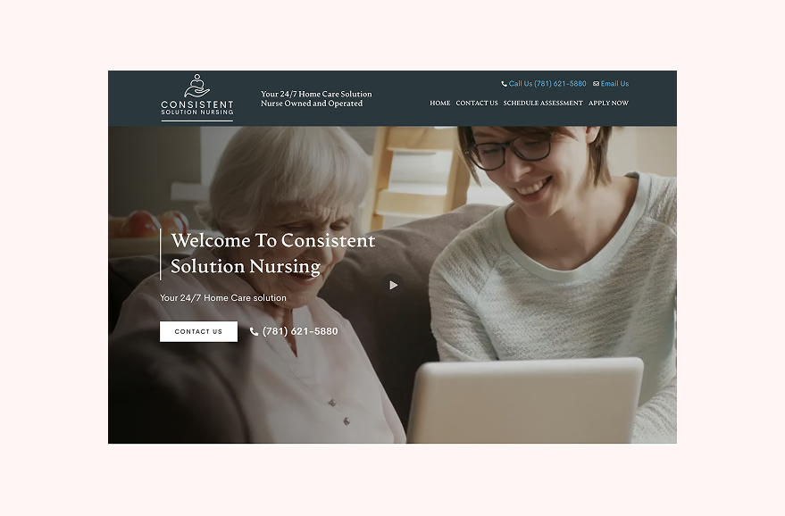
• Multiple, vague CTAs led to confusion
• Nondescript header/subheader.
AFTER

• Clearer, research-backed CTAs.
• Updated labels for ultra clear navigation aligned with specific user needs.
• Benefit-oriented header
Contact form

• Lack of microcopy left user confused and unsure of what to do.
• On the product side, this form led to inconsistent and missing information for the owner,

AFTER
• Updated microcopy guides user through the booking process, providing a timeline, contact preference, and option to get in touch now (friction points/needs we uncovered during our research and testing rounds).
• What’s not shown here:
We suggested (and designed) a verfication screen that informs users of next steps.
We updated the error messages to be targeted to the specific problem.